Allogical Picture Space
Transparence and depth in an abstract picture space
Cort Vallis, Klausenburg, Romania 2004

Frederick Bunsen
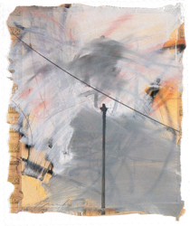
Ohne Titel 1992, 112 cm x 90 cm, Acryl auf Papier
• Romanian Translation 
• Hungarian Translation 
• Zum Autorenverzeichnis
• Zur Hauptseite von Frederick Bunsen
Viewers who are set on discovering recognizable objects in the paintings of Frederick Bunsen won't be disappointed, at least not at first. The artist even allows for it, explicitly provoking its case that his paintings might create an association, so as to play on the nature of recognizable objects.
He applies marked outlines (e.g. human skulls, geometrical structures, and winding pathways) as governing forms. Pictures, which usually refer to landscapes mark the human presence in either industrial or urban settings but also in natural landscapes. Their reception relies on the inherent recognition that the elements of association are conferred only secondary importance, yet are asserted anyway as surplus to further enhance the observer's appreciation and understanding of the painting.
Of course, an observer's fascination and standpoint are not supposed to be fixed on recognizable objects. In any case Bunsen's paintings don't allow for simple, flat surfaces, or display insipid sequences of lines and paint. His landscapes build on complex fields of depth and space that allow for multiple form selections in constituting meaning. Because the different painting dimensions are constantly jumbled in the line of view - from the foreground to the picture horizon, they ultimately join to comprise the paradigm of Bunsen's picture space.
Of foremost design are the vestiges of action made by the hand, in which the artist marks a curve or drafts a straight, unbroken line; the imprint of a wooden plank submerged in color; unreadable, chalk-marked scripture with writing-like quality; large wiped off surface areas, dusted lightly with pigment to blush with a subtle touch of pastel. The application of these diverse paint forms are resolved as optical layers so to produce picture depth and picture space of contradicting nature, a depth that can't be constructed logically. Inconceivable in a mathematical framework, an allogical picture space is tautly stretched between misty veils of form enshrouding paint - thick opaque lines in the background diverge with a foreground of thin linear texture i.e. sovereign, illegible scripture-like forms (ecriture), which uses the picture's surface as a plane to inscribe - while only forging the appearance of belonging to that field. Any layers that might be composed of traceable lines or brushstrokes, nevertheless blend together, usually melting into a kind of fabric so that clear determination of any one layer is made obscure: Their position in the field of depth changes constantly as they forever oscillate back and forth across the painting surface.
Layers weave in and out of each other, never allowing the picture space to converge on a single plane, or combine so as to build just one, dull surface: The apparent layering of the picture space, the effect that depth has in the painting, is, for the most part, due to the fact that Frederick Bunsen avoids gesticulate expressiveness with his lines. The heavy wiped marks and worked paint of his backgrounds, the use of wooden utensils for pressing forms onto the painting, and the long drawn out, but straight lines hinder any impression of expression, or physical or psychological exertion. An expressive sensitivity is underscored in the artist's hand that allows for the manifestation of psychological energy and emotion, where a sensitive line resounds space, the articulate recedes. On the other hand, his paintings also advance the suggestiveness of a blueprint-like line structure: They seem to sketch objective energies, or want to contain layered strata; they take on an impartial coolness of technical drafting tools (to which the photography also belongs).
The neutral, non-expressive visual reality of these pictures is additionally intensified by Bunsen's color pallet. He breaks with the continuity of color as a form through applications of so-called non-colors, in which color and ton opposites become lost (grays and shades of brown).
Indeed, he also intervenes with delicate non-colors that are settled just on the perimeter of color, so that it's hardly distinguishable if they are color or not: Daunted whites, water-spots, smudges, and marks of spreading paint that, above all, make evident their own materiality as records of the original application, and function only indirectly as color.
Somewhere between the expressive force of the materialness - in telltale signs of paint applications across the picture face, and the visual effects produced by the picture space oscillates a real understanding.
© 2001